Citi Self-directed Investing
Citi had the products. What it was missing was an experience that made customers want to manage their own wealth digitally, rather than depend on a financial advisor.
My role
Lead UX designer
Duration
10 months
Time
2020
Platform
mobile native iOS
Background
Business opportunity
Citi was losing over $2 billion in net outflows to self-directed brokerage firms like Robinhood and Acorns. The products existed, brokerage accounts, watchlists, goal tracking. But the experience was siloed, inconsistent, and built for compliance rather than customers.
Design scope
I led UX across the self-directed investing redesign as part of a larger team of 2 PMs, 2 UX designers, 3 UI designers, 1 researcher, 1 UX writer, and 2 vendor partners. My scope covered product definition, UX design, and conduct review and cross-functional support.
The goal wasn't to add features. It was to make what Citi already had feel worth using.
Approach
Research first, design second.
Before sketching anything, we ran a customer needs survey, mapped the competitive landscape, and audited the existing experience end to end. That foundation shaped what to prioritize, what to cut, and how to align a team of 11 across two vendor partners.
Discover
Survey findings
Research showed that ~80% of high-net-worth consumers were open to a trusted resource playing some role in their wealth strategy. Citi had the trust. The digital experience wasn't holding up its end.
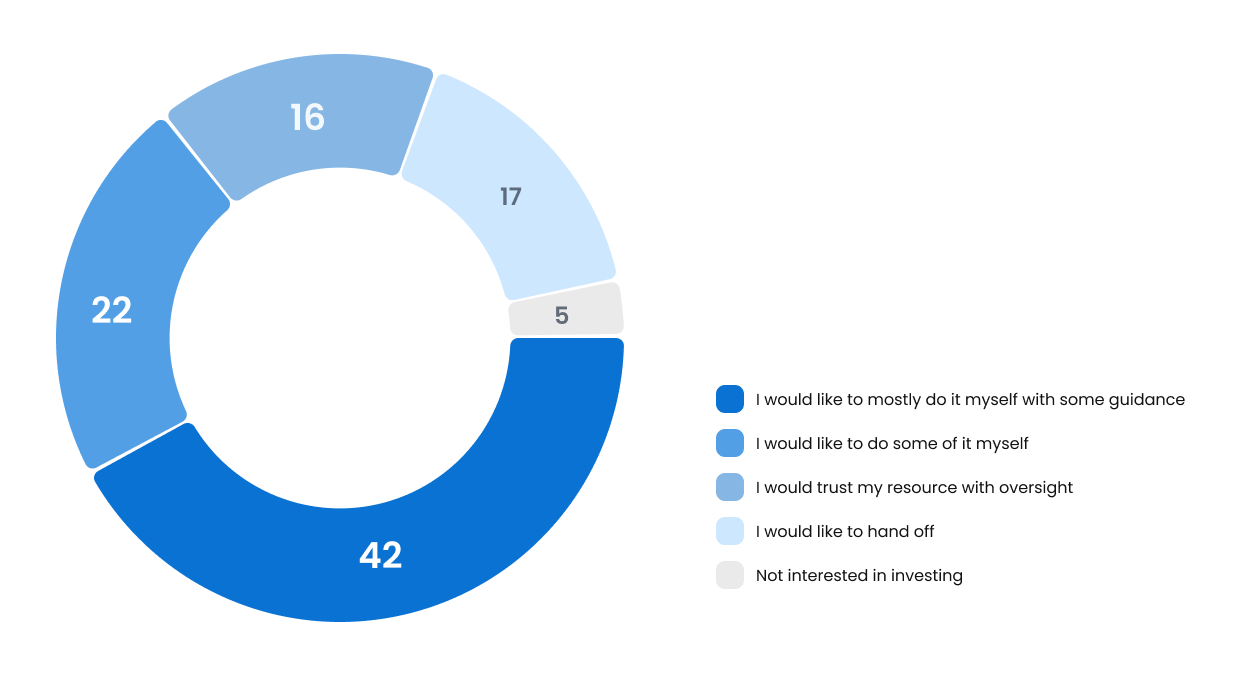
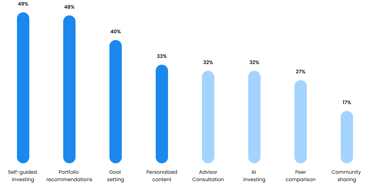
A customer needs survey (n=130) confirmed the priority order: self-guided investing ranked first at 49%, followed by portfolio recommendations at 48%, and goal-setting tools at 40%. We had our direction.
Competitive landscape
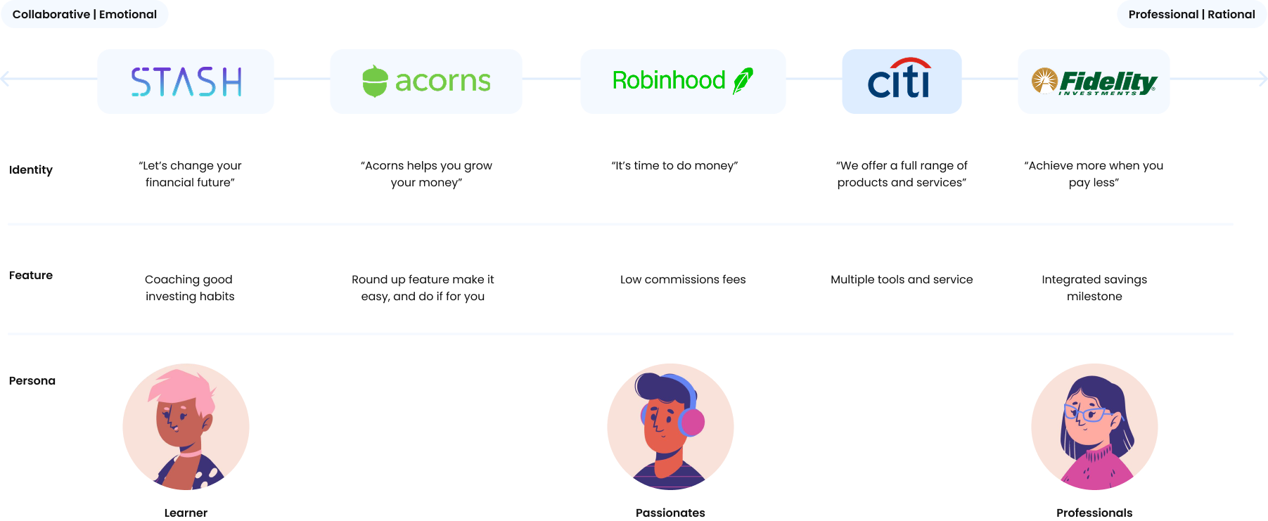
I mapped Citi's position against competitors on a collaborative to professional axis. Citi sat squarely in the professional/rational quadrant while competitors owned the emotional, accessible end. The gap we needed to close wasn't a product gap. It was an experience gap.
Define
Status quo challenges
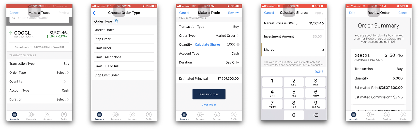
The audit revealed three core problems: overwhelmed information density in the Make a Trade flow, inconsistent interaction patterns across screens, and a visual language that felt dated next to modern fintech apps.
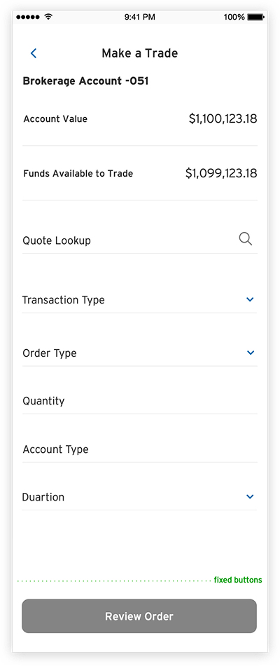
The existing Make a Trade experience had multiple unstructured entry points, duplicated steps, and required customers to scroll past order fields with no visual indication that more inputs were waiting below.
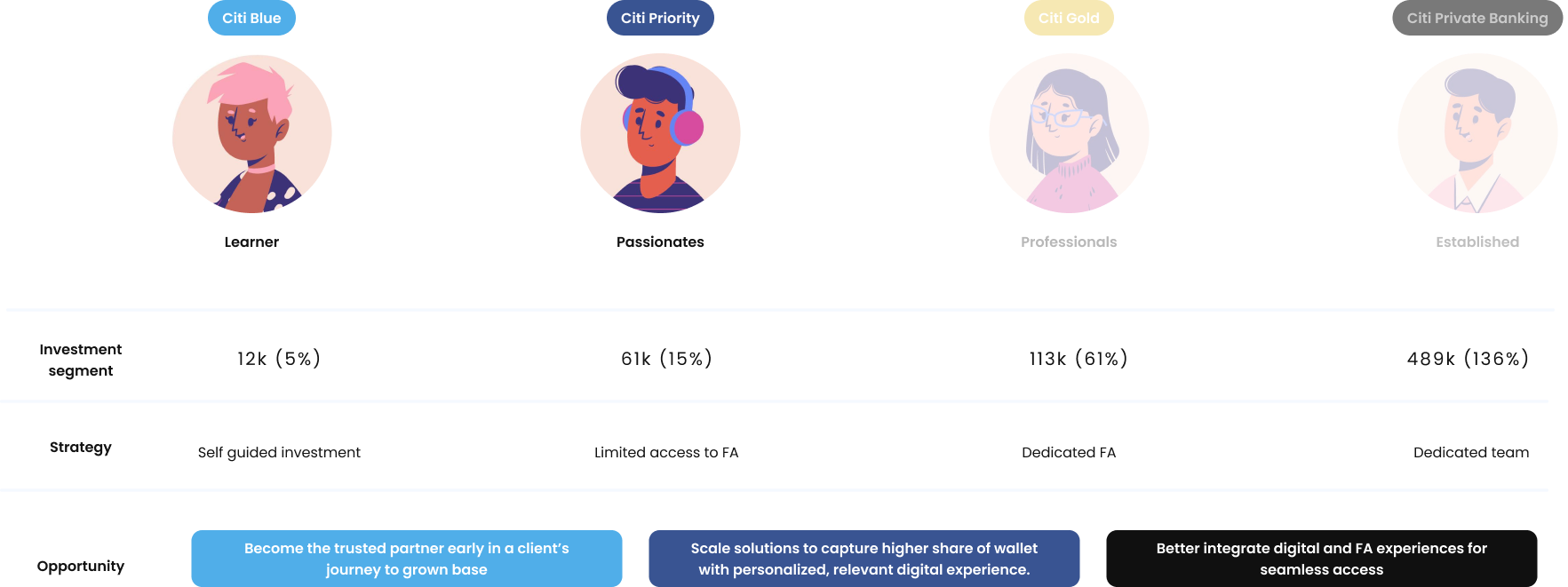
Target customer
We focused on the Getting Started and Future Focused segments, the mass market and emerging affluent customers who were most likely to self-direct and most likely to leave for a competitor. These customers needed a digital-first experience that felt as capable as a human advisor, without requiring one.
Architecture
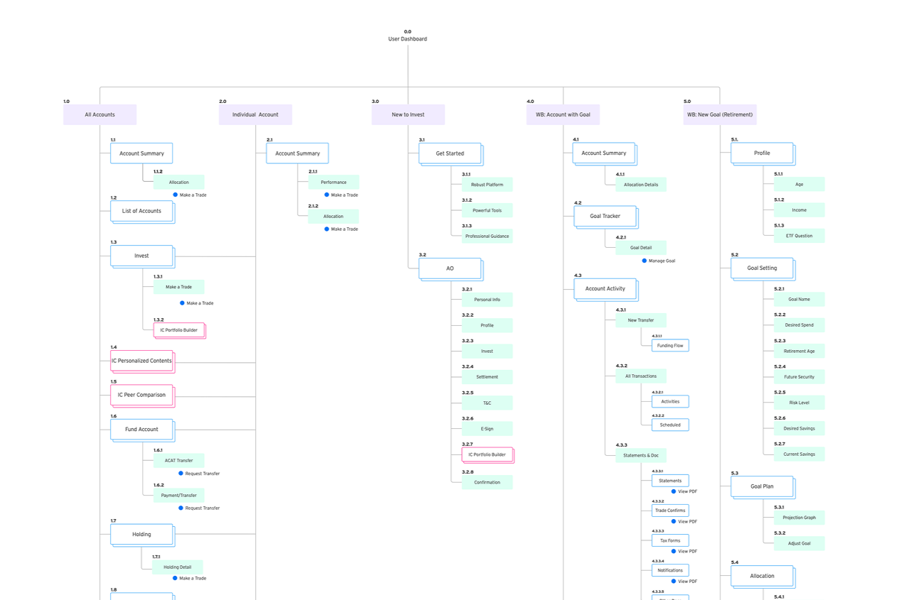
I mapped the full wealth ecosystem IA across 5 main product trees: All Accounts, Individual Account, New to Invest, Wealth Builder with Goal, and New Goal. This gave the team a shared view of the full scope and helped us size effort realistically before a line of design was drawn.
Design
User flow
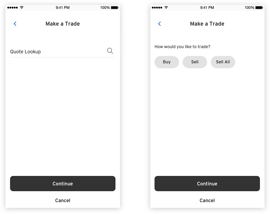
I explored two flow architectures for Make a Trade
A streamlined multi-entry flow and a fixed single-path flow.
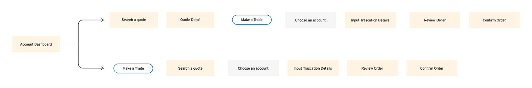
The audit showed customers were confused by too many ways in, so we moved toward linear clarity while preserving quick access from the dashboard.

Interface exploration
Three interface directions for the Make a Trade screen were explored.
Option 1
prioritized visual consistency with minimal dev effort.
Option 3
took a conversational, step-by-step approach with space for educational content.
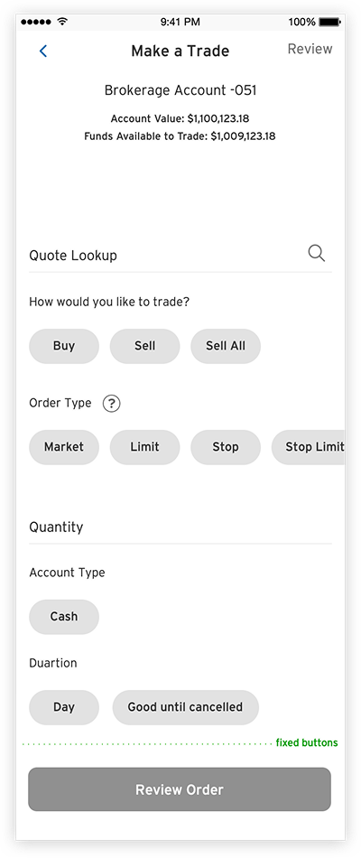
Option 2
surfaced all options upfront with enhanced interaction.
I brought all three into usability testing before committing.
Usability testing
Six Citi customers with active investment accounts participated in a one-day lean usability test using unmoderated InVision prototypes.
Key findings:
the Make a Trade button was easy to find, but customers didn't realize they needed to scroll past
Order Type as no visual cues indicated more fields existed below. Order Duration was unclear to less experienced investors.
The Confirmation page met expectations.
These findings directly shaped the final direction: sequential input with visible field progression, inline educational tooltips for order types, and a cleaner confirmation summary.
A/B testing
I ran quantitative validation on two key UI decisions.
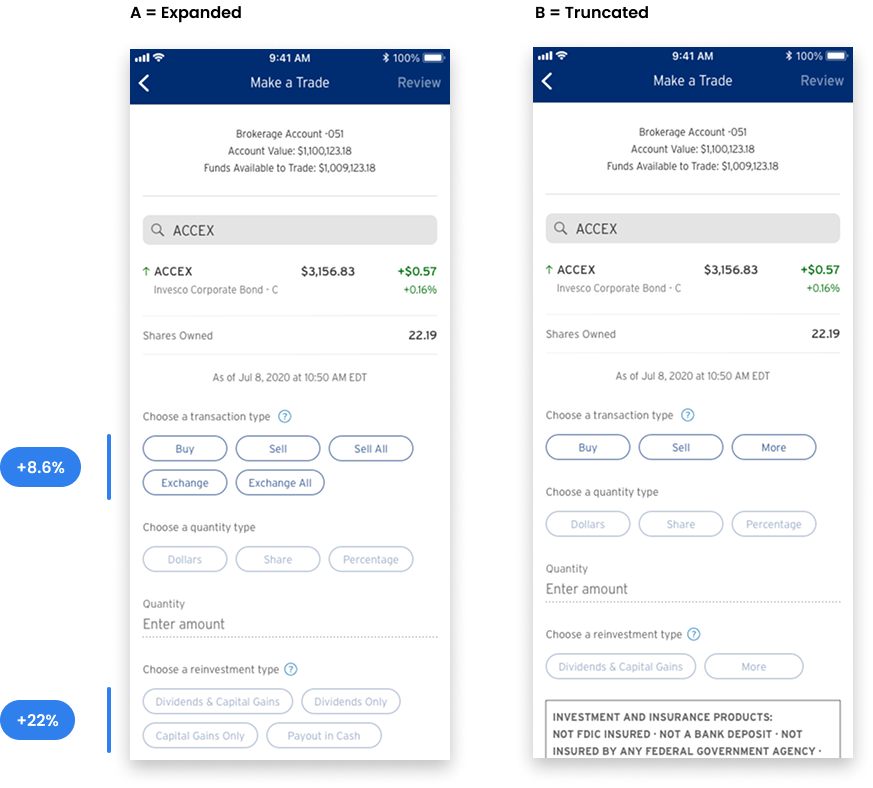
For the layout of the Make a Trade form, 60% of respondents (n=220) preferred the expanded options layout over the truncated pattern.
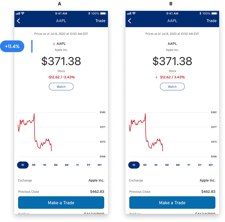
For stock direction indicators, 53.3% (n=195) preferred the arrow and color combination over color alone.
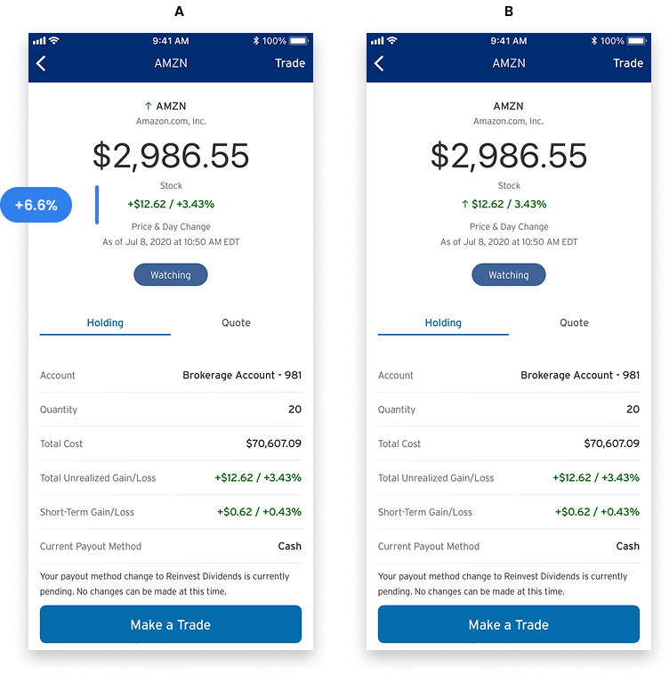
For the Holdings list view, 60.1% preferred symbols with both arrows and indicators, citing that the redundancy made movement easier to read at a glance.
Deliver
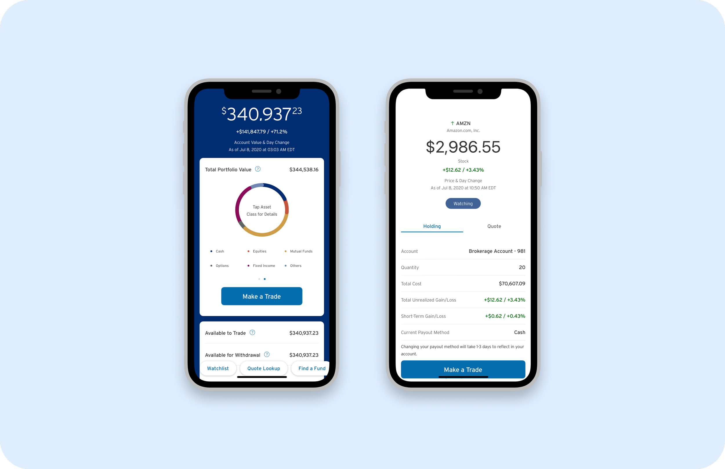
Deliver the basics
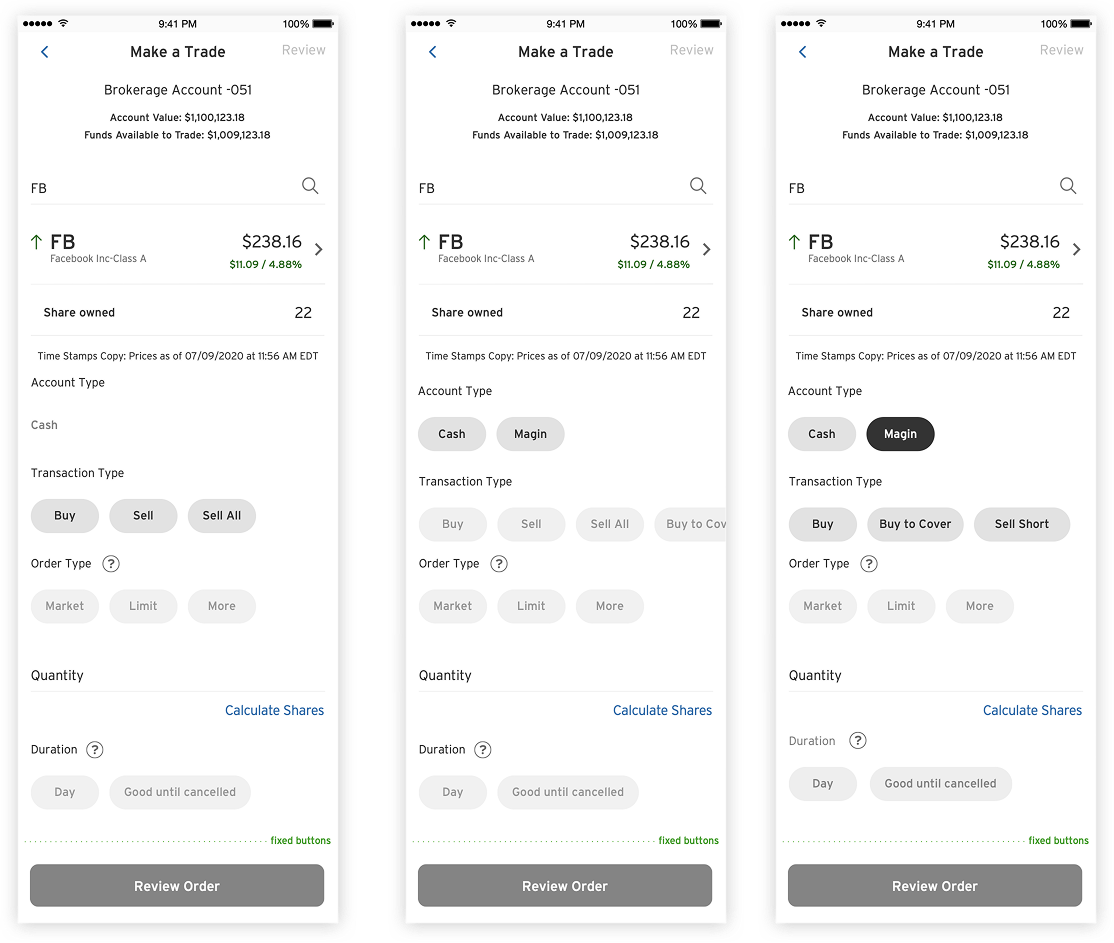
The core redesign covered the dashboard, Make a Trade flow, Quote Lookup, and Holdings Detail. The updated dashboard consolidated portfolio value, asset allocation, and quick actions into a single view. The Make a Trade screen moved from a dense dropdown form to a sequential, inline experience where each selection reveals the next relevant field.
Quotes and Holdings
Redesigned Quote Detail and Holdings views with consistent direction indicators, cleaner information hierarchy, and inline Watchlist management. Annualized returns and tax lot details were surfaced without requiring navigation away from the holding.
Personalized content
Collaborated with a vendor partner to redesign the Portfolio Builder experience. The vendor version had strong fund-selection logic but weak visual hierarchy. I redefined the step structure and information architecture to match Citi's brand and reduce cognitive load during fund selection.
Valuable capabilities
Designed the Financial Readiness education hub with a gamified challenge structure, Bronze, Silver, and Gold levels, and a course library covering diversification, risk, and goal-setting. The intent was to turn the gap between new investor and confident investor into a product feature rather than a support problem.
Impact
This was a foundational redesign across a product area where the prior experience had grown organically over years without a unified design voice.
60% of surveyed users preferred the expanded layout in A/B testing (n=220)
53% preferred arrow and color direction indicators over color alone (n=195)
Usability testing validated the sequential input approach before any engineering effort was committed
Customer feedback
“This option most clearly communicates how my current holdings are performing because there is an up or down arrow to the left of the stock symbol”
Takeaway
Leading UX across a cross-functional team with vendors, PMs, researchers, and engineers taught me that design alignment is a deliverable, not a byproduct.
The A/B testing program was one of the most useful things we built into the process. It gave the team a shared language for making UI decisions based on evidence rather than preference. Running research before committing to direction, not after, was what made the scale of this redesign manageable.